find your perfect postgrad program
Search our Database of 30,000 Courses
- by Charlotte King
- In Other, Study in UK
Posted July 4, 2011
Data Visualisation Competition - The Winners
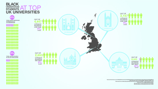
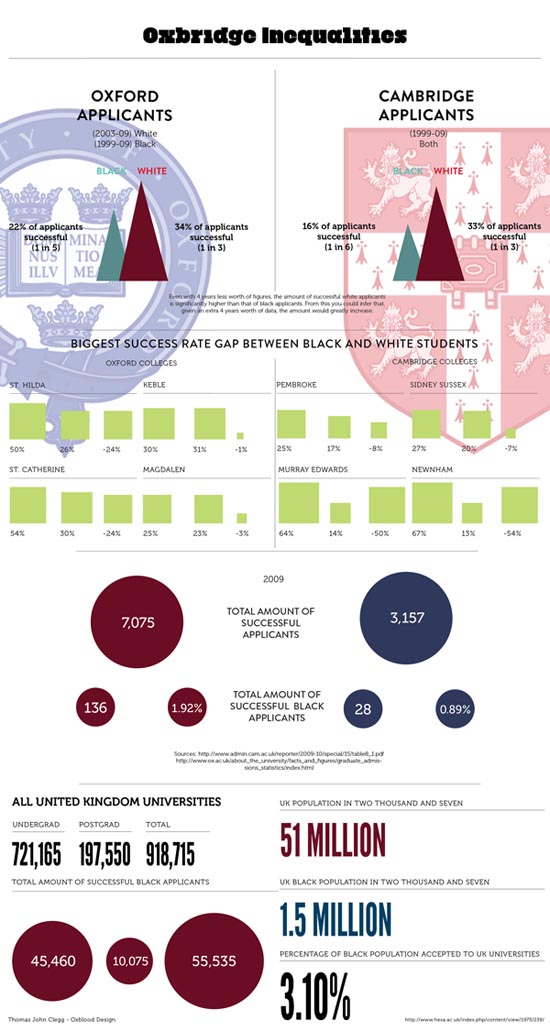
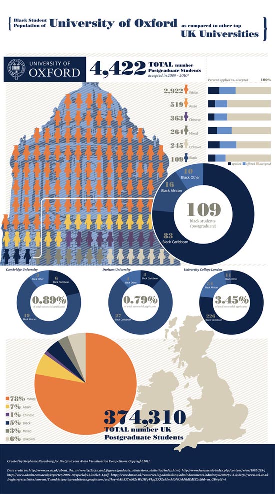
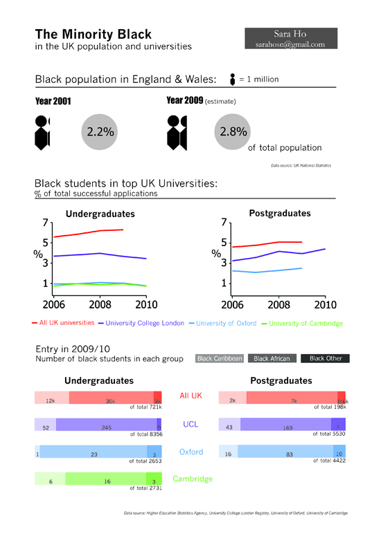
Six weeks ago, we launched a data visualisation competition with David McCandless. The brief was based on some data that David had collected about the ethnicity of student attending elite universities in the UK.
After much deliberation by our expert panel of judges, the votes are now in.
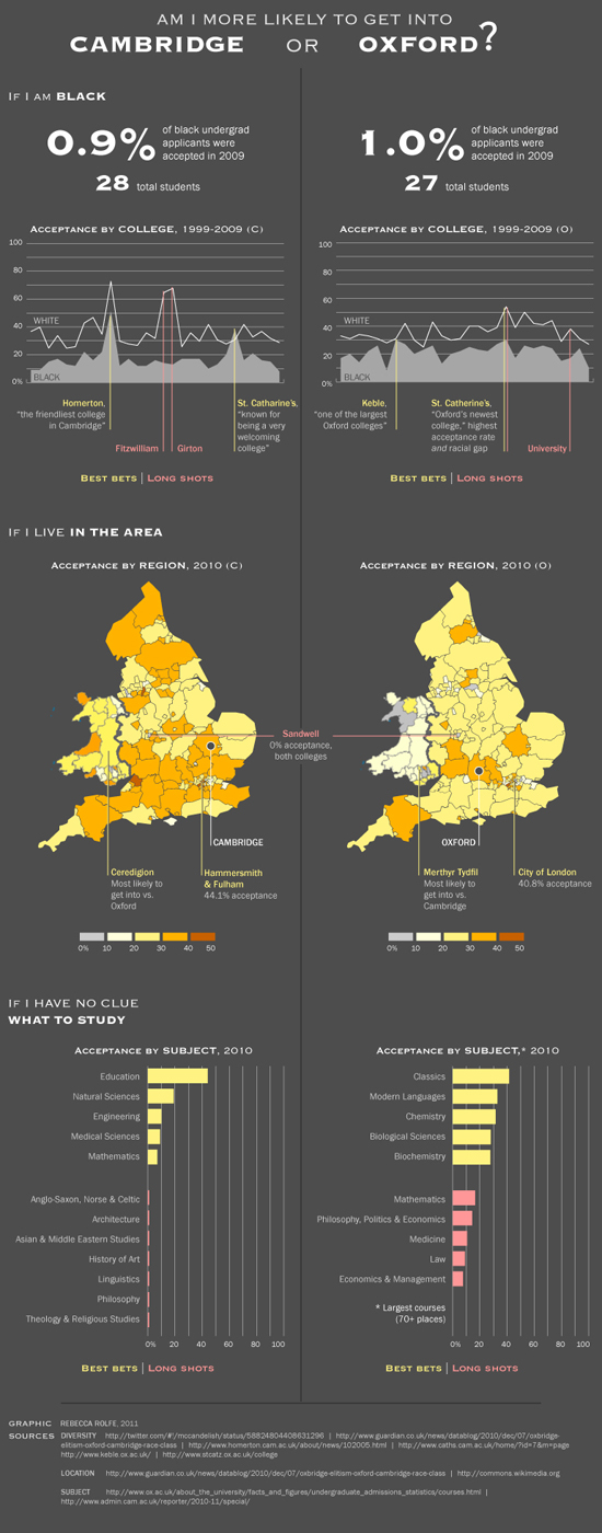
1st Place
(Interactive - built in html5) 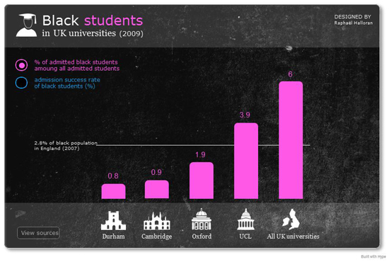
by Raphael Halloran
View the interactive version here
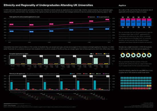
2nd Place
by Dave Bowker
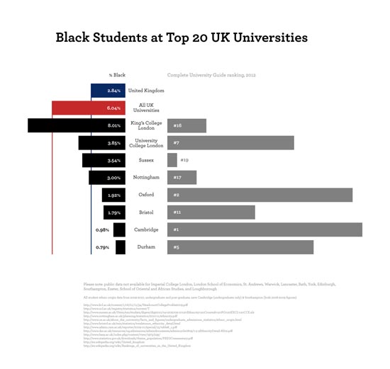
3rd Place
The contestant in third place, Jon Schwabish from Washington, describes himself as "very much a newbie". This is only his second ever infographic - a very promising start!
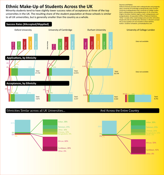
by Jon Schwabish
Highly recommended
by Karl Sluis
Highly recommended
(Interactive Visualisation using InstantAtlas ) 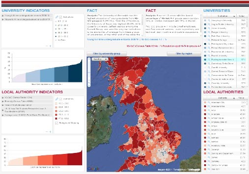
by Gareth Piggott
View the interactive version here and more information about this entry here.
Highly recommended
(Interactive - built using JavaScript) 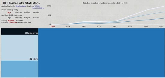
by Kevin Lynagh
View the interactive version here.
During his work for the competition, Kevin cleaned up some UCAS data and has made it publicly available here.
Highly recommended
(Interactive visualisation using Tableau Software) 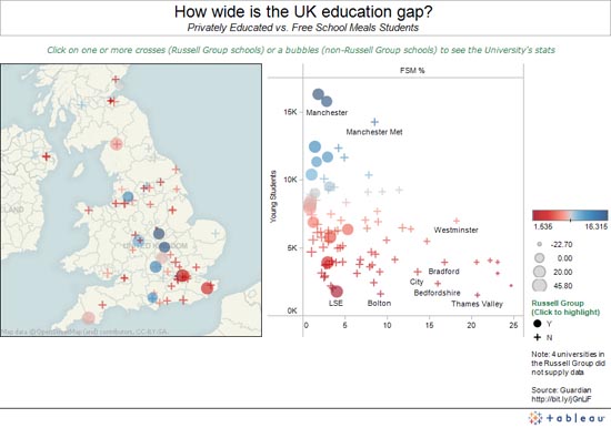
by Andy Kriebel View the Interactive Version here.
by Thomas Clegg
by Lemuel Dix
-- 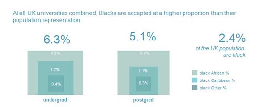 View the interactive version here by Kelly Martin --
 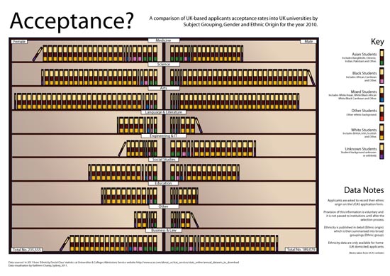 by Kathleen Champ
-- 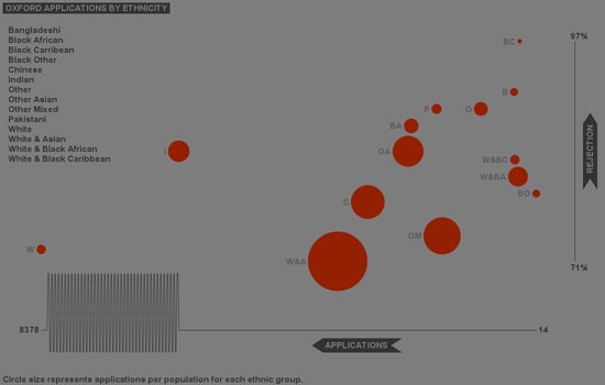 by Jen Lowe View the interactive version here --
 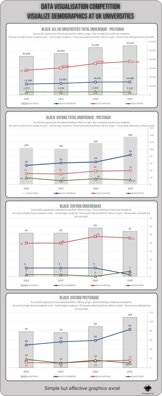 by Diego Althabegoiti
-- 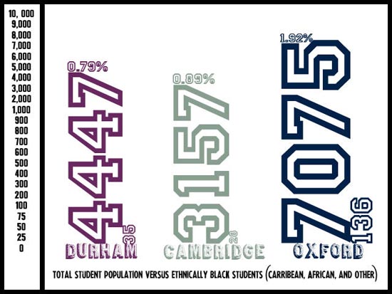 by Crystal Joseph
-- 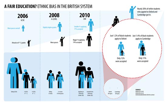 by Corinne Pritchard
-- 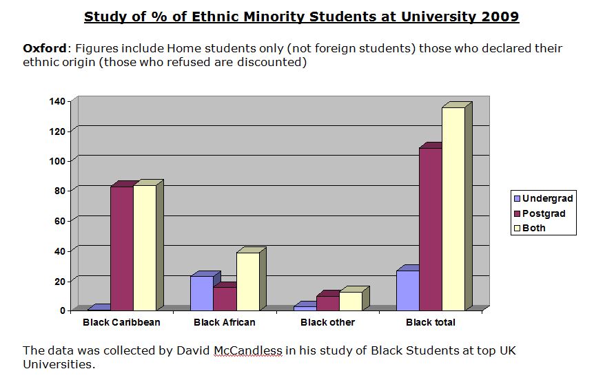 by Joanne Batchelor
-- 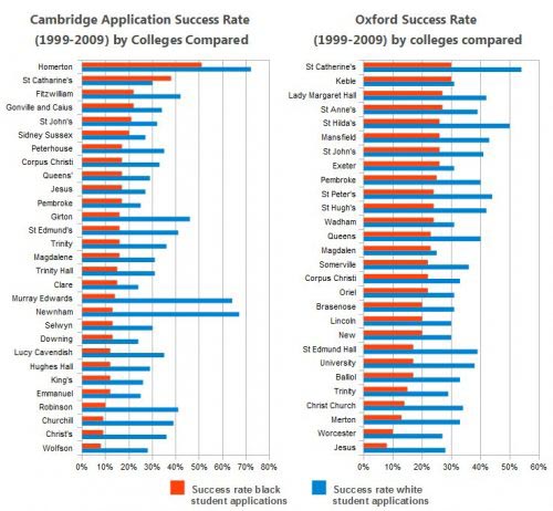 by Christian Pauschert --
 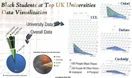 by Catherine Wicks
-- 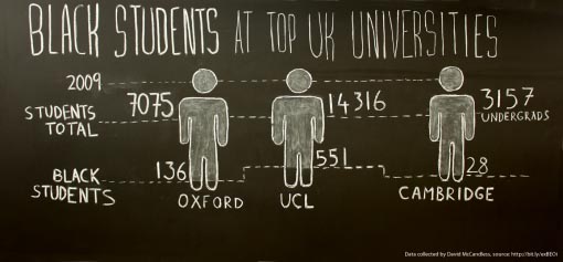 by Bogdan Ferariu --
 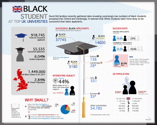 by Rahma Utami --
Data Journalism
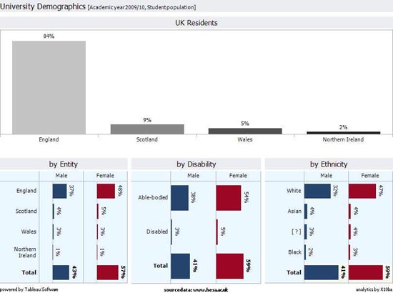
The following is a self-declared 'non-entry' from Richard Oldham. Richard explains "I have to accept this is a NON-ENTRY because it fails on two counts. Firstly, it’s about elitism in the selection process at Oxbridge rather than the proportion of black students at Oxbridge and secondly and most importantly it’s not based upon real data. I based my info graphic on the data from The Sutton Trust's, University Admissions by Individual Schools, February 2008 "
"I wanted to produce a chart showing every schools average grades at A-Levels and then the average grade for entry into Oxbridge. Sadly, while the information on each schools average entry grade to Oxbridge is available I was unable to get this information in time for the deadline. I spoke with The Sutton Trust, who said they may be able to give me the data for free but not before the 20th June deadline."
"Likewise, I also spoke to UCAS, they said they'd be able to give me this data, but at a cost of £250. So because the information show on the table is not from real data, but instead from an intelligent estimate based upon statements and data in The Sutton Trust report, this can’t be a real submission. Still I've spent a bit of time on this so it’s a shame not to send it in."
We're glad Richard did send it in. And look forward to hearing how he gets on in his investigation.
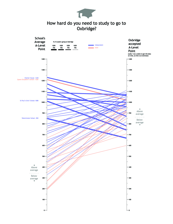 --
--
Visual Metaphors
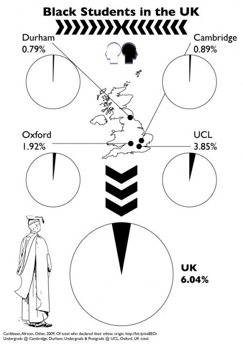
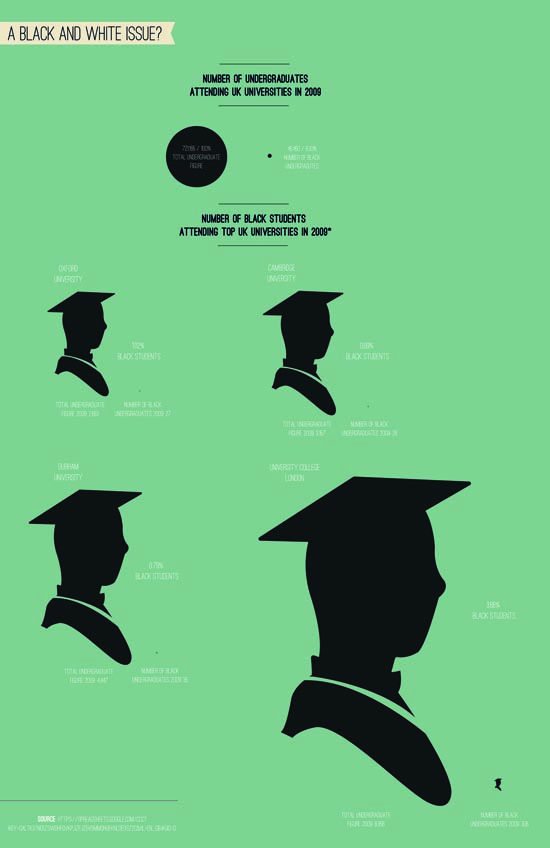
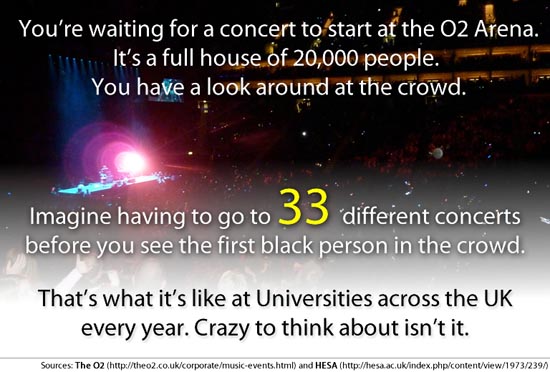
Another entry which caught our attention is included below. Having tried different charts and graphs, Luigi Masi decided a headline statistic and visual metaphor was the best way to go. We admire his boldness in this approach, and not feeling obliged to force the information into a visualisation. However, the Maths don't quite add up unfortunately. Nice idea though.
 --
--
Thank you
It has been a great experience running the competition, and we were delighted with the level of interest, as well as the support we received from the data visualisation community.
We are also indebted to our judges for giving their time and expertise to help select the winners.
And of course, many thanks are due to David McCandless for taking a punt and allowing us to run this competition with him.
Thank you to all involved. And congratulations once again to our winners!
So what did you think?
We'd love to hear your thoughts on the competition in the comments section below:
Categories
- Accommodation
- Budgeting
- Coronavirus (Covid-19)
- Courses
- Distance Learning / Online Study
- Fees
- Funding
- General
- Infographic
- International Students
- Jobs and Careers
- Mature Students
- MBA Programs
- Other
- Personal Statement
- PGCE
- PHD
- Student Life
- Student Welfare
- Study Abroad
- Study Advice
- Study In Australia
- Study In Europe
- Study In Ireland
- Study in UK
- Study In USA
- Theses and Dissertations
- Top 10 Lists
- Universities
